Red Bull and Mercedes have dropped their shiny new logos for the F1 2026 season, signalling fresh starts amid the biggest regulation shake-up in years. Both teams eye the top spot as the grid resets with lighter cars, sustainable fuels, and active aero magic. After Red Bull’s near-miss on a fifth straight title, Max Verstappen fell just two points short of Lando Norris; these tweaks add real intrigue.
Red Bull’s F1 2026 Logo
Red Bull’s update is subtle but nostalgic. They’ve reintroduced white strokes around the “Red Bull Racing” text, echoing designs from their dominant past. It’s a nod to older liveries, sparking fan buzz about a potential throwback scheme. With their in-house power unit debuting alongside Ford, this logo hints at bolder changes. Expect the full reveal at a Detroit launch on January 15, where Verstappen, now paired with Isack Hadjar, might get his wish for a “shiny” look over the matte blue era.
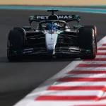
Mercedes’ F1 2026 Logo
Mercedes, tipped as early favourites, went for clarity in their refresh. The iconic three-pointed star sits in a flat white circle, ditching the 3D gloss for a cleaner vibe. Below it reads “AMG Petronas Formula 1 Team” in signature teal. This keeps their black-silver-teal palette intact, perfect for George Russell and Kimi Antonelli’s title push. After six tough years post their eight-title streak, Mercedes banks on advanced F1 2026 prep to reclaim glory. The simplified design screams focus, no distractions, as they chase the Australian GP opener.
The F1 2026 grid promises chaos and cinema. Max Verstappen stays in the hunt, McLaren defends their crown, and newcomers like Cadillac stir the pot. These logos aren’t just branding; they’re battle cries for a reset era. Stay locked in; the real show hits Melbourne soon. Buckle up, F1 faithful, 2026 looks electric.
Also read: Laurent Mekies Sets Expectations For Isack Hadjar In 2026